Lotus-

Building trust

Where it matters

Transforming a child-focused behavior analysis site into a polished, trustworthy platform for parents and clinical professionals.

Turning a daycare-coded website into a trusted clinical resource through research, brand strategy, and a ground-up redesign.

Role
Lead Researcher & Designer
Type
Website Redesign / Branding
Platform
WordPress (migrated from Wix)
Problem

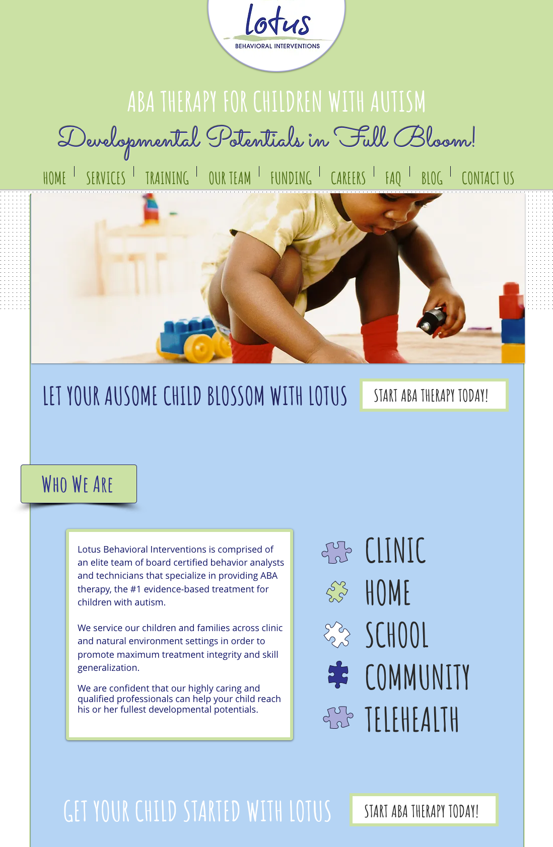
A professional ABA practice was invisible online. Its website spoke to children, not parents.

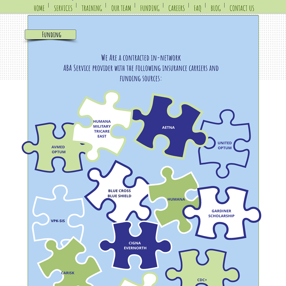
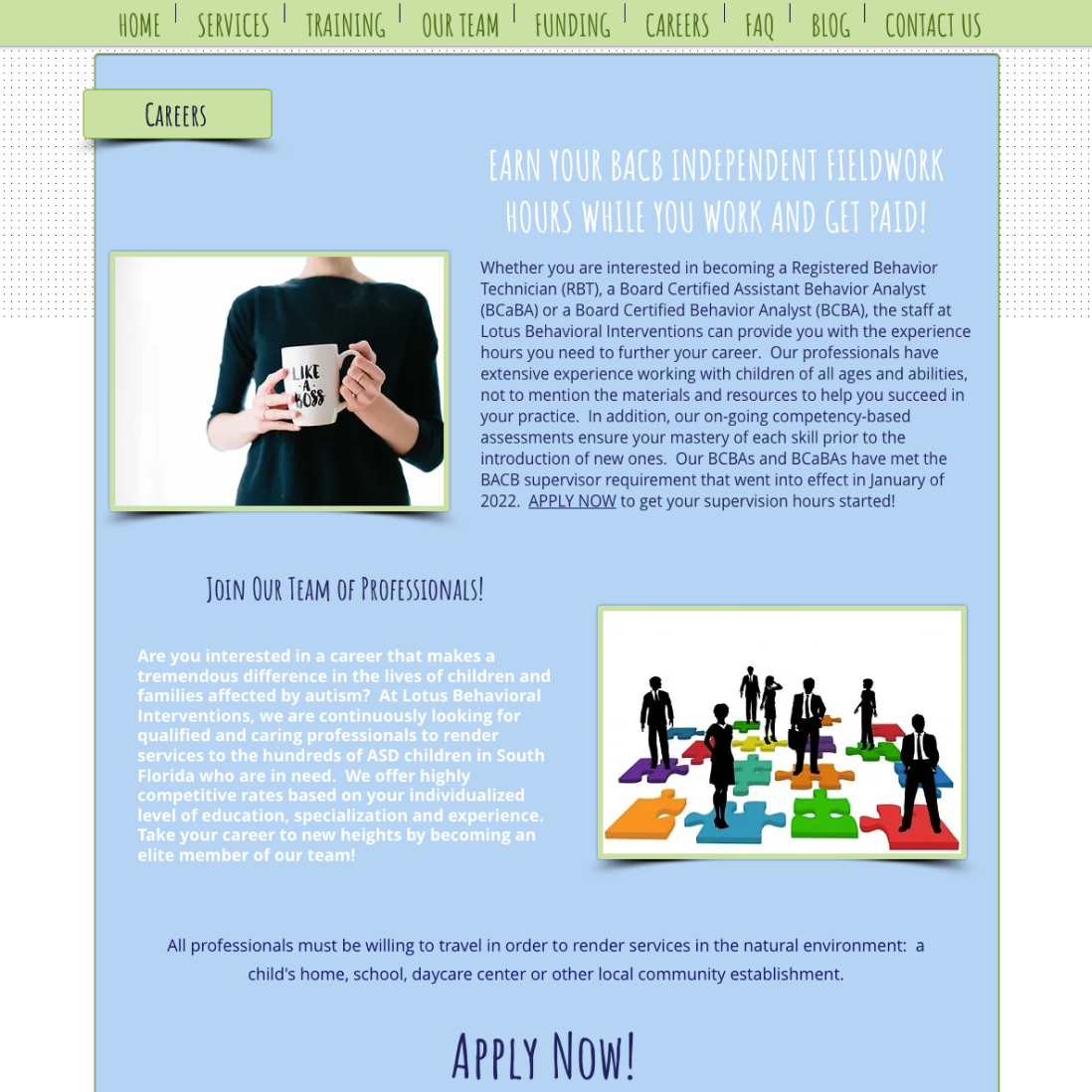
The visual language of baby blues, lime greens, and a childish typeface signaled daycare, not clinical practice. Parents couldn't find insurance or services quickly. And the Wix platform was silently capping their search visibility. The site was failing the company on every front.

Research

Who is this really for, and what do they need the moment they land?

Key Insights
04
What the research revealed

Four things that drove every design decision
Insight 01
The site was aimed at the wrong person
The decision-maker was a parent: emotionally invested, time-constrained, and evaluating multiple providers. The design spoke to children. That had to change completely.
Insight 02
The visual design was eroding trust
First-impression results were unanimous: parents associated the existing palette and typeface with a daycare rather than a clinical practice they'd trust with their child's development.
Insight 03
Insurance and services were always the first two questions
Every parent said the same thing: if they couldn't find insurance and services quickly, they left. Neither was on the homepage.
Insight 04
The careers page wasn't attracting quality talent
Staff interviews confirmed it: qualified BCBAs had no reason to choose Lotus over a competitor. No culture, no personality, no story.
Competitive Analysis
03
The whole category looked the same

Pastel palettes, bubbly typefaces, stock photos of children playing: every competitor was aimed at kids, not the parents making the actual decision. Lotus was indistinguishable from the rest. That sameness was the opportunity: a site that looked professional and parent-focused would stand out immediately.

Patern 01
Childlike visual language
Pastels and rounded fonts designed for children, not the parents making the decision.
Patern 02
Insurance & services buried
The two things parents needed first were absent or hidden on nearly every competitor site.
Patern 02
Generic stock photography
Interchangeable photos with no differentiation and no signal of real team culture or expertise.
Patern 02
No credibility signals
Credentials, certifications, and insurance logos were rarely featured. These are the trust signals that matter most to a skeptical parent.
User Testing Tasks
02
What I asked participants to do

Four tasks designed to expose friction

Question 01
Find what insurance companies Lotus accepts
Nearly every participant struggled. The information was buried, and this became the most urgent fix in the redesign.
Question 02
Navigate the site as if you're going to apply, from start to finish
Behavioral interviews with real group travelers. Questions were anchored in specific past events rather than general opinions, surfacing emotional responses that direct questioning tends to miss.
Question 03
Act as a potential hire: how does the application process feel?
Staff found the careers section sparse and uninspiring. Nothing communicated what it was actually like to work at Lotus.
Question 04
At a glance, how does this website make you feel?
Parents used words like "colorful," "cute," and "like a daycare." Not one said "professional," "trustworthy," or "clinical."
"It looked like every other ABA website. There was nothing that made Lotus stand out or feel more professional."  -Current Lotus client
Methods & Participants
01
Approach

Being embedded at Lotus as a BCaBA gave me direct access to real clients and staff, which an external consultant rarely gets. I ran task-based sessions with ~10 parents and ~8 current employees, half in-person. Sessions combined navigation tasks, first-impression questions, and prototype feedback.

Method
Participants
Goal
Client interviews
10 Parents
Understand decision-making and first impressions
Employee interviews
8 Staff
Culture, hiring perception, internal pain points
Stakeholder interview
CEO
Business goals and brand alignment
Competitive analysis
10+ ABA sites
Category patterns to learn from and differentiate against
Hueristic evaluation & analytics
Existing site
Concrete usability violations and traffic gaps
Task-based Usability Testing
Semi-structured Interviews
Competitive Analysis
Heuristic Evaluation
Before & After: Careers Page
09
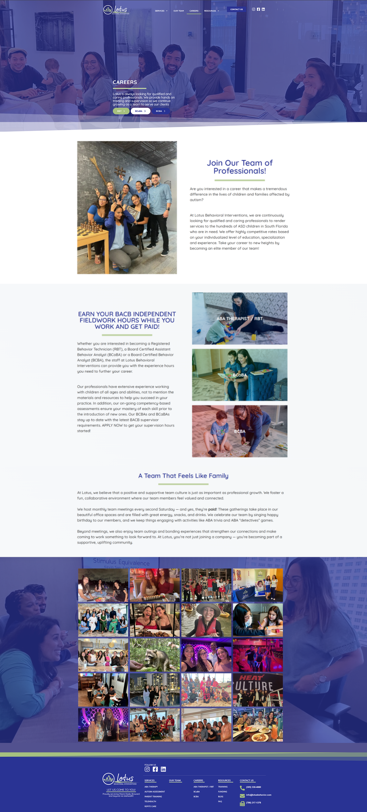
Attracting quality tallent

The original careers page gave talented therapists no reason to choose Lotus. I rebuilt it around real photography of team outings and events, attracting candidates who were values-aligned rather than just job-hunting.
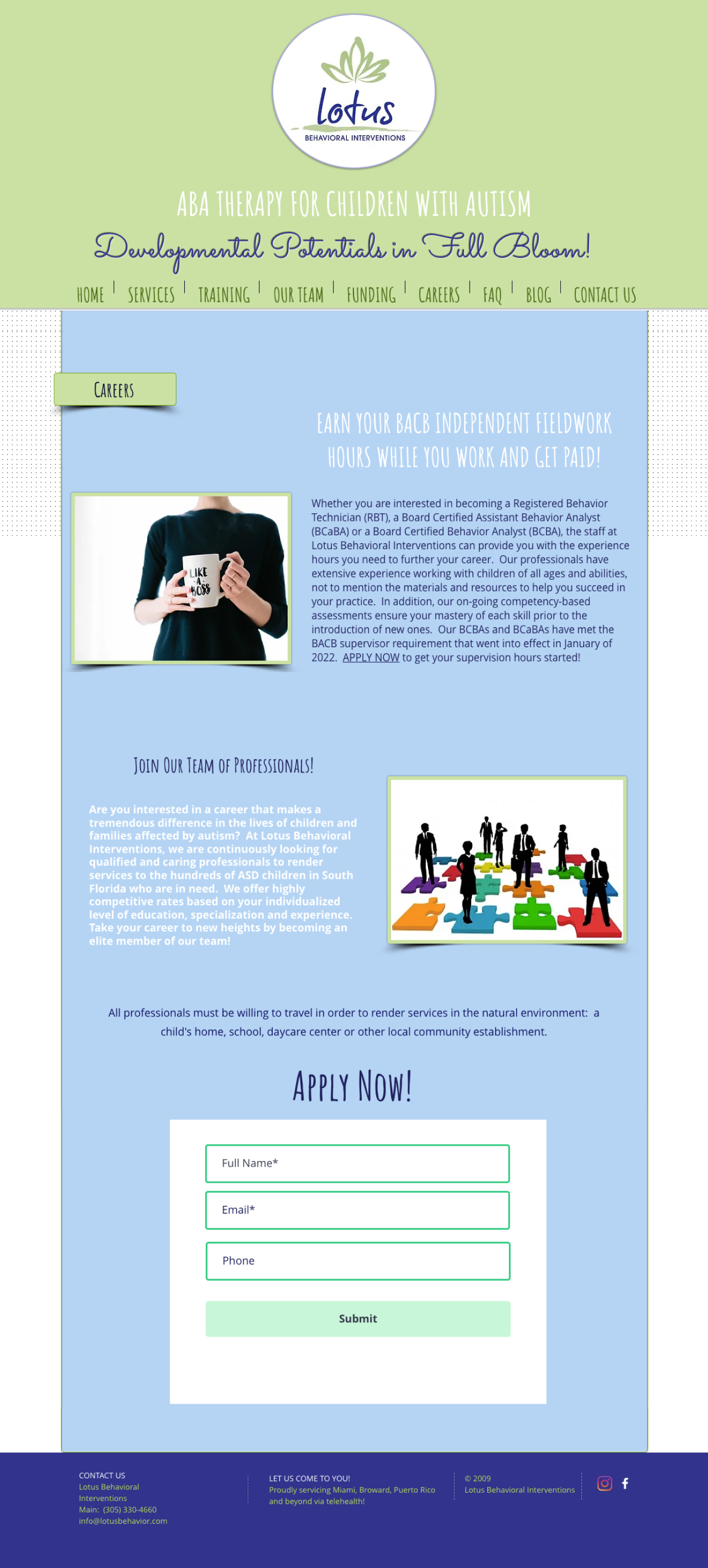
Old Careers Page
New Careers Page
Before & After: Homepage
08
Same company. Completely diferent signal

The old homepage pushed users toward a booking CTA before establishing any credibility. The new one leads with authority, surfaces insurance immediately, and uses real team photography throughout.

Old Homepage
New Homepage
Logo & Typography
07
A flexible logo system and a single purposeful typeface

I restructured the original stacked script logo into a cleaner horizontal lockup system with multiple variations for different contexts. For typography, I chose Quicksand: geometric, modern, and readable, with enough warmth to feel approachable in a clinical setting.

Old Logo
New Logos
Typograpgy

Heading - Quicksand Bold

Subheading - Quicksand SemiBold
Body - Quicksand Regular: "ABA therapy improves communication and learning through evidence-based behavioral methods."
LABEL · Quicksand Medium
Color & Brand Strategy
06
Color as a deliberate trust signal

I replaced the baby blue and lime green palette with a deep cobalt blue (#293394), the color associated with trust, authority, and competence across healthcare, finance, and law. The full palette follows the 60/30/10 rule: 60% white, 30% navy, 10% sage green (#AEC688) for CTAs and accents.

Primary Blue
#293394
30%
Accent Green
#AEC688
10%
Background
#FFFFFF
60%
Old Palette
New Palette
Design Principals
05
From findings to direction

I worked with the CEO to translate each research finding into a design principle. If a decision didn't serve at least one of these, it was cut.

Trust first, always
Every visual decision should increase client's confidence in a clinical, professional team.
Reduce friction immediately
Insurance and services must be findable within seconds of landing. No hunting.
Differentiate from the category
If every ABA site looks childish and generic, looking professional is the biggest competitive advantage available.
Show the real culture
Real photos of real people, not stock imagery. Serves both parents evaluating the team and therapists considering joining.

Design Decisions

Brand, color, type, and the before and after transformation.

Outcome

The design that came out of listening for behavior instead of opinion

Reflections
11
What I learned
Starting with audience definition was the right call
Grounding the project in "who is this really for?" gave every design decision a clear rationale and made the CEO far more receptive to a full redesign.
I'd formalize the research protocol earlier next time
Sessions were somewhat informal given my existing relationships. A more structured screener would have produced more rigorous documentation for stakeholder buy-in.
Next: post-launch testing with cold visitors
Moderated sessions with people who find the site through search, rather than existing clients, would validate whether the new hierarchy works for a first-time audience.
Results
10
First week results

The research-first approach paid off immediately

Within the first week of going live on WordPress, Lotus hit the first page of Google for relevant Miami searches, something that had never happened on Wix. Traffic doubled and users were actually exploring the website. Qualified applicants with ABA credentials began applying at a higher rate than before.


2X Website Traffic
Visitors more than doubled in the first week compared to the previous site.
Google Ranking
First-page results for relevant searches within a week of launch.
Application Quality
Increase in applicants with relevant clinical credentials and experience.
Satisfied Stakeholders
The CEO responded positively to the site's performance following its rapid growth.